Idea:
After a two year hiatus, I present to you a birthday card project. This year, D’s nieces turn 8. What do 8 year olds like?
Inspiration:
During one of my bloghops to How about Orange, the typography-lover in me gravitated to her A good gallery of free fonts post. I found these two lovely fonts, Mosaic Leaf and Drop Type, which reminded me of coloring book pages. Almost 100% in tune to what I loved as a little girl, one of his nieces loves coloring in rainbow so it only made sense to me to make them a coloring book birthday card.
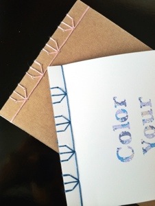
As an afterthought after I completed the design and production of the front cover, greeting page and coloring pages for this project, I realized I hadn’t thought about how I was assembling the pages. I reverted back to my old projects and narrowed it down to stitch binding or paper binding. I decided on stitch binding after discovering the wonderful art of Japanese Stab Binding.
Ingredients:
The Essentials
- Graphic Design Software – Adobe Illustrator is my software of choice
- Color Printer
- Paper cutter (or box cutter and cutting mat)
Paper
- White Cardstock
- White Print Paper
- Kraft Cardstock
Project Specific Supplies
- Mosaic Leaf Font
- JL Hidden Vines Font – As much as I loved Drop Type, the font unfortunately didn’t have numbers so this was the next best thing
- Random Selection Illustrator Script
- Thread
- Needle
- Awl (or a nail and a hammer)
- Paper clips (or clothes pins)
Instructions:
The card comprised of 4 parts:
- Coloring pages
- Front Cover
- Greeting Page
- Binding
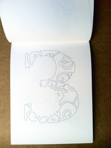
Colored Pages
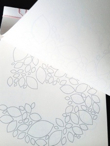
For the coloring pages, each page was printed with a number from 1-8, and the font was hollowed out to its outlines (it’s a coloring book after all). I used Illustrator to make my 5″x7″ pages:
- Create 4 artboards
- On each artboard, draw 2 5″x7″ rectangle. These will serve as outlines for your print and cut.
- Within the rectangles, using your patterned typeface at a font size of ~400 pt, type a number
- Center each number to each of the rectangles
- Select all numbers and expand the font
- Reverse the coloring so that there is no fill color and only a line color
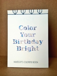
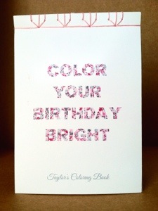
Front Cover
Using the same patterned font, I typed my cover message and made it a mosaic of colors.
- Create an artboard
- Draw a 5″x7″ rectangle
- Within the rectangle, using your patterned typeface, type your message
- Select the message and expand the font
- Hide all the other layers in the project and only display the newly typed message
- Select all paths of the message and ensure it is completely ungrouped and all compound paths are released
- Select the Random Selection Script, enter a percentage and change the color of the selection
- Select one of the paths of the original color
- Select all with the same fill color
- Repeat steps 7-9 until you have the desired mosaic of colors. With each repeat of the step, be sure the increase your percentage since your pool of paths is decreasing
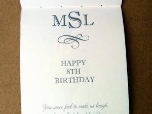
Greeting Page
I wanted the greeting page to look a little like a subway sign. I used this wedding monogram as an inspiration. There isn’t much instruction here. Just type and adjust accordingly!
Binding
- Find a pattern you like (Using sources like Becca Making Faces)
- Assemble your coloring book (front cover, greeting pages, coloring pages and a sturdy back cover)
- Paper clip your coloring book together
- Stab (here is where the Awl or Hammer / Nail come in)
- Bind
Images:
Interesting Points:
I have an amusing story about the Awl. When I googled ‘Japanese Stab Binding’, one of the essential tools called for was an Awl. I had to google ‘Awl’ but once I saw a picture of one, I was pretty sure I saw one long ago in my dad’s old tool box but I never knew it’s name. At this time I’d like to blame the namelessness of the tool to the fact that I’m a 2nd gen Asian with parents that called an Awl the ‘big needle’ or whatever we felt described the tool. I took a chance and asked D if he had one in his tool box. Here’s how the dialog went:
M: ‘Would you happen to have an awl in your tool kit?’ (I wondered if I pronounced it right and if I did, whether he even knew what I was talking about)
D: ‘No. What are you trying to doing?’
M: ‘Stab binding.’ (I thought, ‘he’s going to ask what stab binding is next, isn’t he?’)
D: ‘Why don’t you use a nail and a hammer?’
The damn guy knew what an Awl was and was able to deduce what stab binding is! Well color me shock red! So, because of his fine contribution to my crafting world, this post is dedicated to him.


